

About Refining and Designing a Character
This Blog Post will be a bit of a longer one and I will try to break down how my super condensed design process looks like.
As people who have been following and interacting with me for the past year or so probably know, I do my cuts from the get go as I work towards a finished Live2D model, I also don't do any sketching normally, nor any reference sheets, the first design is already going to become a Live2D model.
While this process isn't really suited for a commissions, it is very efficient and time saving, and it's good practice in terms of developing your senses for character design - it is by no means a healthy best practice though, for aspiring character designers, make sure that you can also do it the legit way (aka, drawing many many reference sheets, do reference research, etc. I bypass all of that and go straight to the meat, I don't even look up any references, it's all in my experienced head).

As a result, my progress usually looks something like this... I start with the parts of the head as described in my previous blog post for this model specifically. As you can see, new details are added into the design as I see fit as this new character is being created.

As per usual, I am also going to try to create my models with exchangeable clothes in mind (although it is quite unlikely that I'll be changing this ones clothes, but this is the standard I put onto myself so I will try to go for it anyway). It is also a good practice later on to make sure your clothes on the model actually are positioned correctly.
This is also the right time to talk about color layering. This is one common problem many aspiring character designers have as they get started. We see many vtubers out there who have either, a very bland design which is not recognizable or the extreme opposite, a wild look which is so chaotic our minds can't really deal with it.
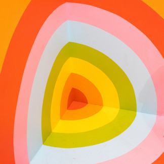
Layering and setting for a simple color palette are key. Now what do I mean with that? Think of a cake. Which of the following cakes are more appealing to the eye (ignore the preference of the taste here):


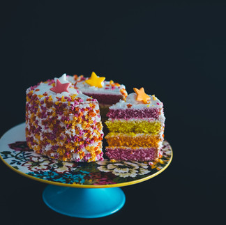


Generally speaking, you will probably already know the answer here, our brains enjoy a healthy mix of different colors in a distinguishable layering - in other words, a light color, a darker color, a darker color and so on. Our brains constantly try to find patterns and this is exactly what we are doing here.

So for this design, I did just that, and you can see, that this method will create a fairly appealing, colorful and naturally pleasing design (still not the final mix here, may change later).
One question you may ask is, what colors should I be using? Generally the world is your oyster, however, there are a couple of best practices here...
Avoid using too many different colors
Using too many colors is generally not recommended, as it overloads our senses and that is obviously not the goal a character design should usually have (unless that was your intention).
Having a smaller color sample will also help people recognize your character faster. Usually recognizable characters don't use more than 1-2 colors (excluding black, gray, white). The more colors you use, the more chaotic it will become.
Try to have a clean mix in the layering
Mentioned this before, but I felt that I should repeat it here. The bigger the contrast is between the layers, the more structured and distinguishable they become. This is where black and white can be applied to make this work pretty much regardless of which 1-2 colors you've chosen to use for your character.


If you compare my current design process with the three pictures here you may see the parallels of why it works (hint: because I only use 2 main colors paired with black and white). Make sure to make use of contrast, you got this.
Balancing Color Distribution
This is important if you work with multiple main colors, but define the distribution of the different colors and stick with it for the whole character and each of their parts aka, if you say by design is the following:
40% Green
30% White
20% Black
10% Gold
Make sure that you at least try to keep that ratio for each part to make the design feel balanced out. There is a tolerance to change that balance for each part, but try to not divert from it too much.
Also it is not recommended to split the character in two sides (aka Two-Face style from Batman), unless that is the theme you are going for...
I will show the finished design in the next blog entry (base colors) and we will have a look at what decisions were made.
Comments